
Why It's Past Time to Get Responsive
- Google Inside AdWords
A little History Lesson: WAP vs. RWD
Just a few years ago, it made sense to put the majority of your design efforts into the desktop site while treating the WAP mobile site as more of a supplementary site. It made sense in 2013 to focus your design efforts on the sites that got the most traffic, i.e., desktop. Abandoning desktop for mobile or vice versa didn't make sense.
However, the older mobile site were designed for older feature phones which bring just a fraction of the processing power and graphical capabilities of today's phones — they're now capable of handling fully robust web experiences.
So what's a brand to do? If you're running two or more separate sites, you're having to split your design efforts between desktop, tablet, and mobiles sites. That's more development time and more design time. Responsive website design solves this problem and eliminates the need to simultaneously develop multiple versions of the same website.
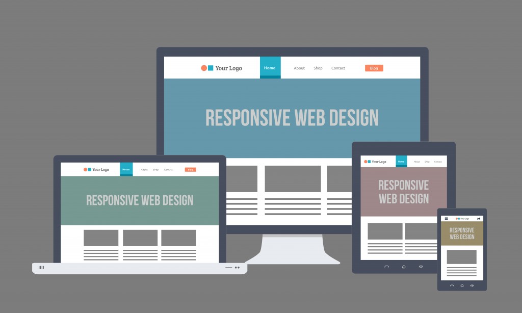
What’s Responsive about Responsive Design?
In short: responsive design uses customized CSS implementations based on the dimensions of your web browser window dimensions instead of predetermined static sizes. It makes it so you experience the same web content regardless of what device you're using to view.
Responsive web design uses CSS computer scripting to communicate with the device that’s accessing your website. The CSS script optimizes how your website will display across any size screen. Instead of creating multiple website versions for the ever-changing set of devices and screen sizes on the market, RWD is a fluid framework that responds to the individual user by using flexible images and CSS style rules to change the user experience by device and by the size of its screen.
Here are some statistics to back up this presumption:
-
A DoubleClick study from 2016 showed that sites are abandoned if they take just three seconds to load on a smartphone.
-
Curatti says, “A single second delay in your website loading time can result in a 7% loss in conversion, and 40% of web users will abandon a website if it takes longer than 3 seconds to load.”
-
Sweor reports that 57% of Internet users say they won’t recommend a business if their website views badly on mobile.
-
Sweor also reports that 8 of every 10 customers will drop content quickly if it’s not displaying well.
-
It’s likely that your SEO and Google rankings will be negatively affected without RWD.
Responsive is the New Black
Design Recommendations to Keep in Mind
Designing the site itself is fairly straightforward as you can address errors with RWD display as they arise.
However, when you're working with content like advertisements and third-party widgets you may often find yourself trying to fit round pegs into square holes. The pegs can still fit in many cases with some creative zooming as well as post-loading CSS and JavaScript code adjustments. Third parties often bring content to your site through iframes, which can't be style adjusted because of security issues. In problematic cases like static-sized iframe content, you may have to drop content or build pages that aren't RWD compliant.
Bottom line? Your website needs to be responsive.
Need Help Hiring for a Responsive Switch?


