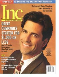
Giving Your Site the Magazine Touch
The website has largely replaced the magazine. Not many of us are as willing to spend five, seven, or even two dollars on some glossy print that's half ads just to read some of the same editorials and articles that we can find online for free.
However, magazines still offer a certain design sensibility that you don't see on a lot of websites. Taking some inspiration from these magazines can be a great way to set yourself apart for creative job placement on web design gigs. Here are a few ideas inspired by real life magazines.
1. William M. Gaines Spends More on Worse Paper
MAD Magazine always prided itself on its "cheap" feel and appearance, going out of their way to print on the coarsest, most low-quality paper that they could find. When the price of this paper went up, publisher William Gaines actually spent the extra money to keep printing on the same stuff, even though it would have cost him less to go with a higher quality of paper. Applying this to web design, we can keep in mind that a glossy, slick appearance isn't always what we're after. Think of the charmingly outdated website for a Karate dojo, or the blogger so devoted to content that they never bothered to change the default font. Sometimes you send the right message to the reader by not going all out on quality.
2. Remember the Little Things
Sometimes it's the little things that define a magazine. How many people do you think pick up the New Yorker primarily for the comics? How many people do you think read Rolling Stone just to see the caricatures by Drew Friedman? The little features that make a magazine complete, the bits and pieces that don't make up the "meat" of the magazine, but the trimmings, are really the biggest thing that set one magazine, or website, apart from another.
3. Guiding the Eye
A magazine places articles and images side by side in a way that leads the eye across the page, like a good painting. Take note of where your eye goes when you look at a page from your website, and focus on how to direct the eye in subtle and interesting ways. There are more ways to format a blog than endless vertical scrolling.
Obviously a website is not a magazine, but when you take certain ideas from magazines, you may just prove that you have what it takes for that creative art director gig.
Gilbert S is a freelance writer available on WriterAccess, a marketplace where clients and expert writers connect for assignments.
___________________________________
Artisan Talent is a Digital, Marketing and Creative Staffing Firm placing talent in jobs perfectly matched with their skills all over the US. For available jobs, to submit your resume, or learn more about working with Artisan Talent, contact us here.
Connect with Us
Linked In| Glassdoor| Facebook | Twitter | Instagram | Pinterest


