When is a picture worth 1,000 Words? When it isn’t a picture at all – when it’s a mood board.
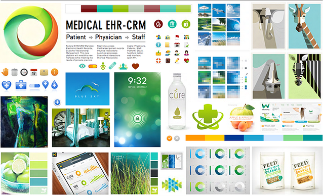
This has nothing to do with the emotional stability of your client, of course. Mood boards are a visual or depiction of the tone of a brand, and designers use them to convey emotion. When words aren’t enough, there’s a mood board.
If you haven’t used one, you should; designers in fields from advertising to architecture have been using them for years to steer the direction of a creative project. So why are they so darned effective?
What is a Design Mood Board?
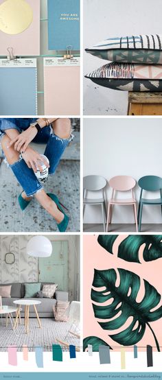
A mood board is a collection of visual images and text, sounds, or even tactile samples that convey a, well, a mood. Let’s not forget that some people are visual learners. If your client can feel the roughness of a burlap bag, coupled with a picture of a cowboy, they’ll start to understand the rustic approach you’re going for.
We like mood boards because, while they are time-consuming, they are perfect for presenting the feeling you’re trying to create behind the brand.
Mood boards are most often used in new client pitches when sharing your ideas for rebranding, or perhaps just to harness some inspiration for you or your team.
Photo above from Canva.
Some common elements of a mood board can include:
- Color palates
- Descriptions (text or solo words)
- Design/illustrations
- Photography
- Pictures
- Textures
- Workflows
The beauty of a mood board is that you are only limited by your creativity.
Don't Be Afraid of 3D
Picture your potential client walking into a pitch only to smell an ocean-scented candle. The lights are low. In the background they hear ocean waves. In front of them are pictures of a quaint seaside town. A swatch of clean cotton rests on the table in front of them. All of these elements convey a sense of quiet reflection. This holistic approach goes beyond the traditional 2-D mood board to encompass all human senses.
No matter how far outside the box you go, mood boards are very effective at evoking feeling.
Or, your mood board could simply establish brand standards by sharing fonts, typography, icons, color, and overall style. Instead of creating a lush feeling, it could simply create a road map for the next website or other projects.
Photo by Love Print Studio.
Ideas for Your Next Mood Board
- Speak to every physical sense by including elements that appeal to sight, hearing, taste, smell, and touch.
- Integrate the mood board directly into your pitch instead of leaving it off as a separate element.
- From loose collage to structured template, the mood board is as complicated or simple as you need to be.
- Involve your clients early. Incorporate their ideas directly into the mood board. That way you’ll have a better shot at engaging them in your shared vision.
Need More Inspiration?
If you need more ideas, check out Pinterest or the Flickr Inspiration Boards. Need a client to create a mood board? We can help you with that too!


/LinkedInPhoto.jpg?width=436&height=255&name=LinkedInPhoto.jpg)
